Ducerf, a new identity revealed

A new logo in solid oak
The idea to use the oak to represent the Ducerf Group came naturally. Undoubtedly. Robust and majestic, the oak is the strong, vital element in its class. It has always been the emblem of Ducerf, specialist in hardwoods for 130 years.
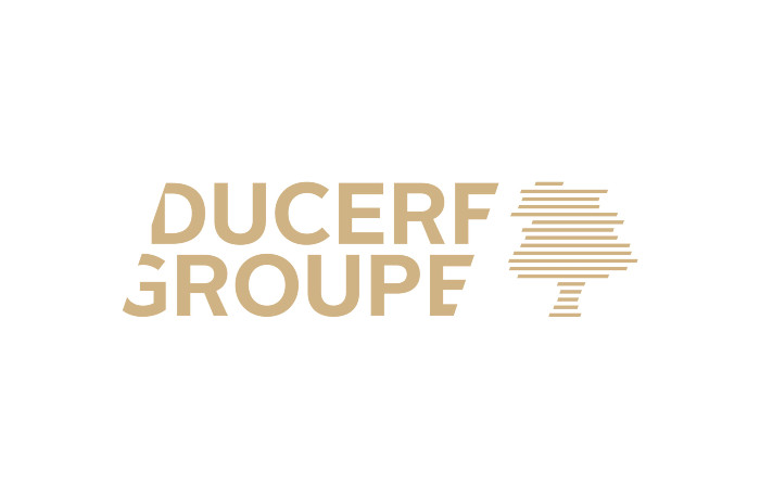
In terms of colour, we made a clean sweep of the past! If the previous logo (three stylised trees) was in shades of green, today it is brown-gold. An elegant colour that recalls the nobility of wood.
The communications agency Le Crieur Public, to whom we are indebted for the new branding and the new website www.ducerf.com, explains: “The green colour of the previous logo recalled more the leaves… And everyone knows that leaves eventually fall! We wanted to work on a more sustainable symbol, more anchored in history and traditions. The oak is strong, with deep roots… There is a family side to this tree, in its roots, just like Ducerf. ”
The oak in the new logo is formed by superimposed horizontal lines. We can clearly see the reminder of logs sawn into finished wood, forming layers. A graphical focus that re-centres the group in its core business: wood cutting.
A typography that slices
Woodcutting is also symbolised, subtly but effectively, in the typography that accompanies the pictogram. The Ducerf Group seems cut at its extremities, like being sliced, just like in the image, with the oak at its side.
A promise full of expertise
With its new promise “Expertise in wood”, the Ducerf Group is underlining its expertise that has been acquired over the last 156 years. Far from resting on its laurels, the group never stops evolving, in response to the market, to society and to its customers.
A new visual identity, a new website… to adapt to a world that’s constantly in motion, to be in tune with the times, to speak to everyone and especially to you – all counting on our expertise every day.
